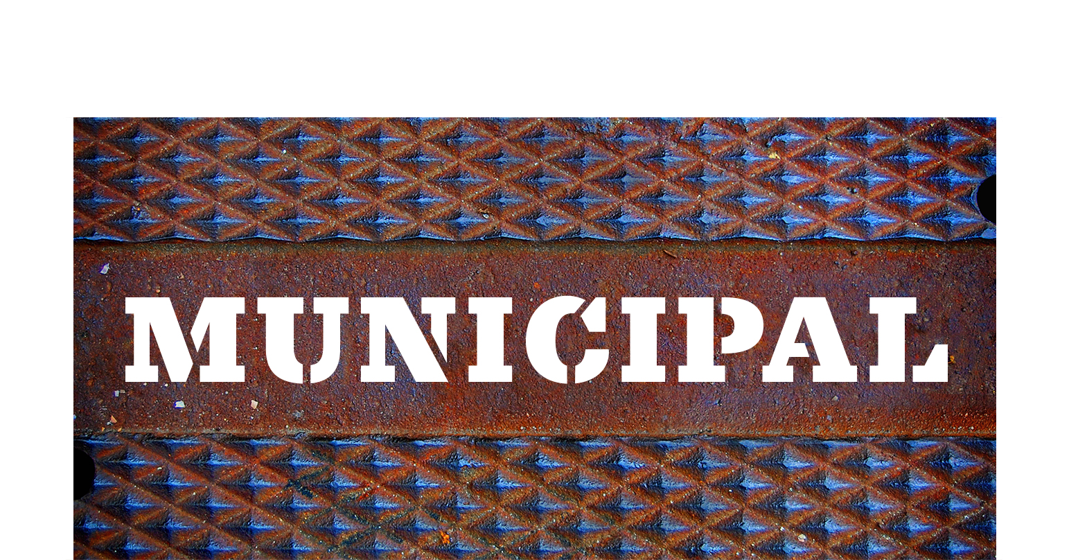
What’s the difference between a hobby, a vocation, and an obsession? Hell if we know. Our type guru Ken Barber has been documenting letters on utility covers since 1990 (we know, weird). Then an “unusual ampersand” on a manhole cover in his wife’s hometown of New Bedford, MA tripped his fontwire. In 2015, House launched Municipal Cast, a one-off ode to water drains, sewer caps and all the utility covers often stepped on, but rarely read. Since Ken’s mind is often in the gutter, he couldn’t help but sketch out an italic complement, and the digital bones of a larger family of fonts. Five years later—five years—Municipal is here. A font that can honestly claim street cred and a fluent understanding of the word on the street. Keep scrolling to learn the full origin story:

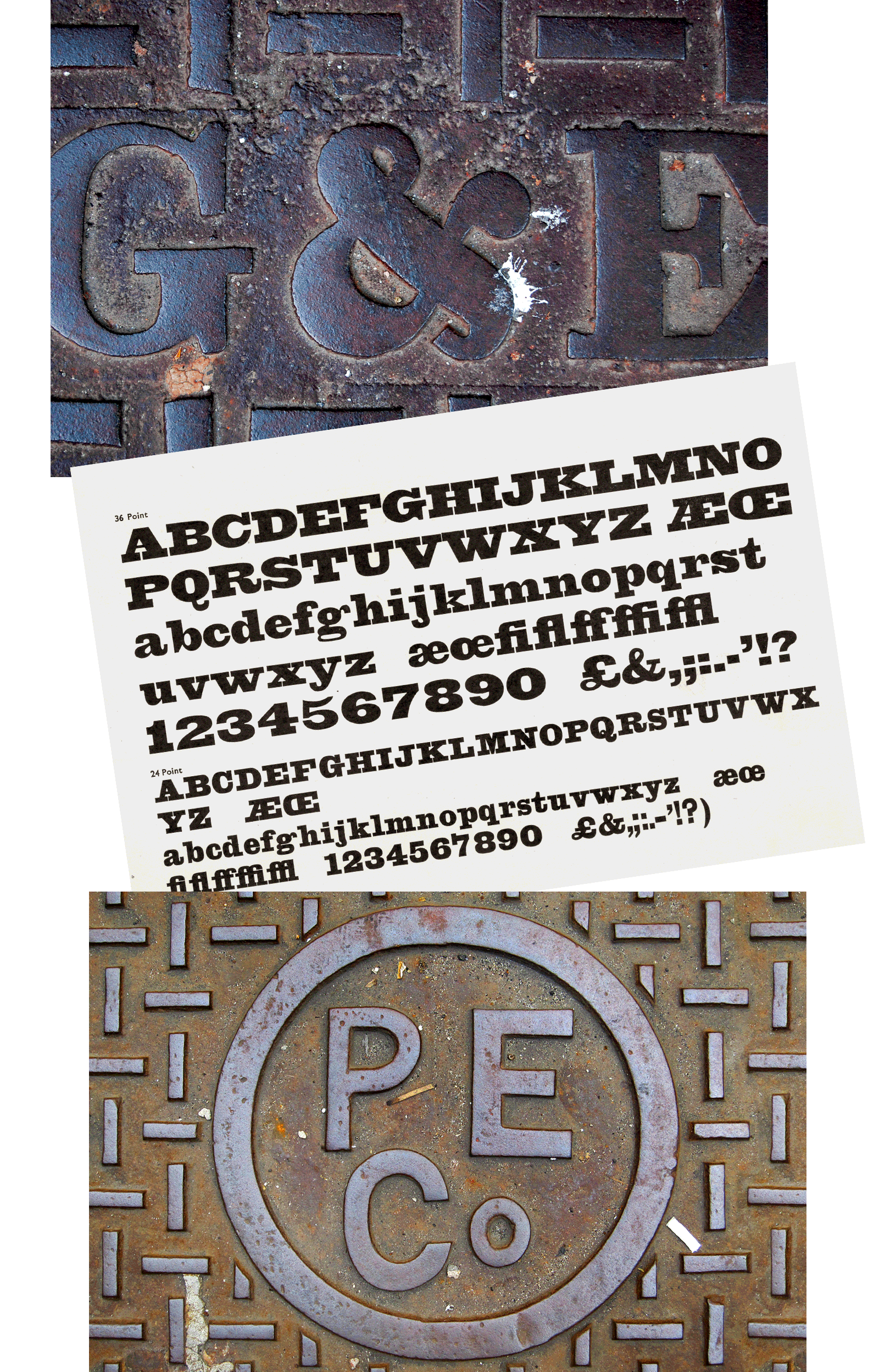
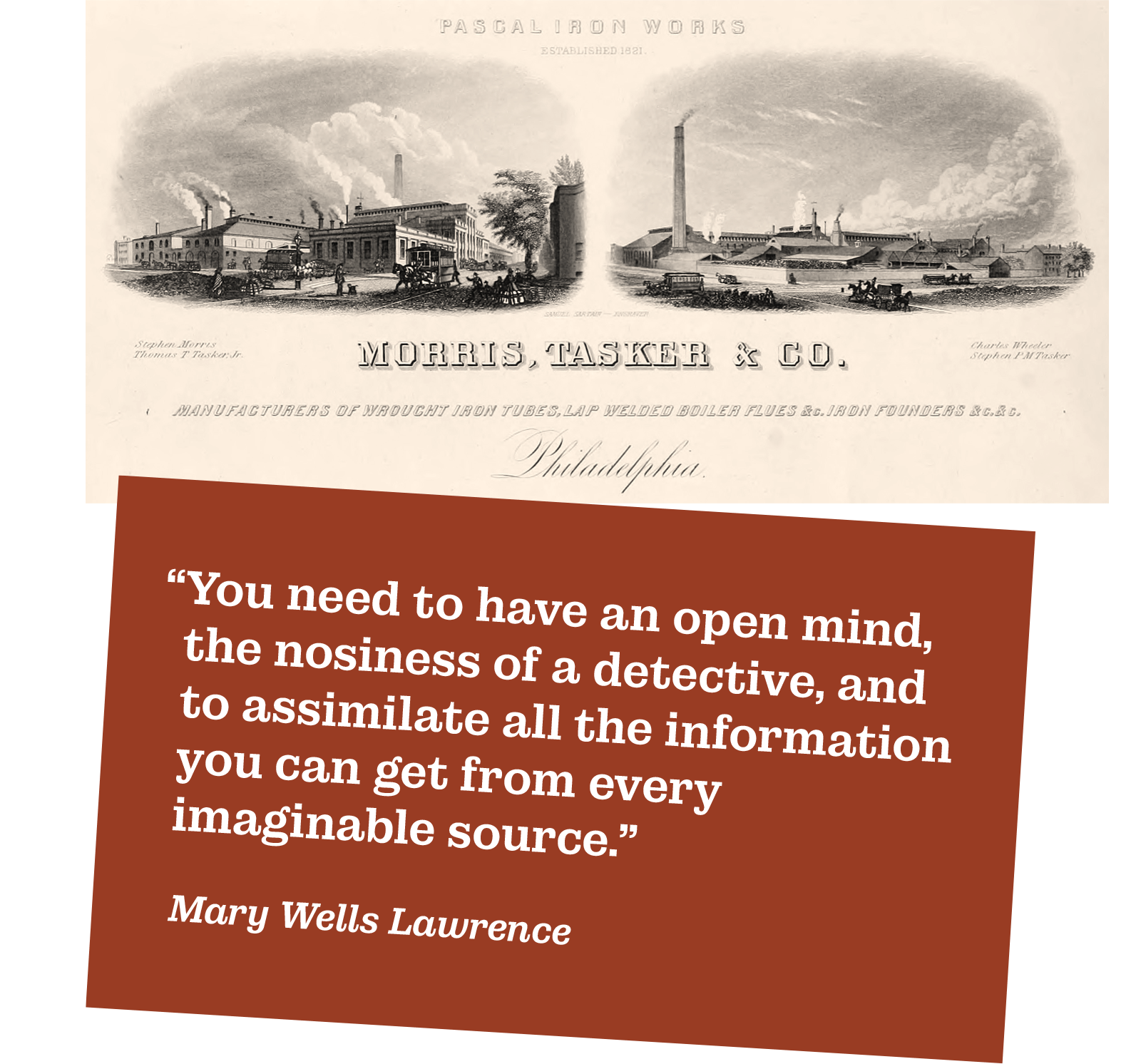
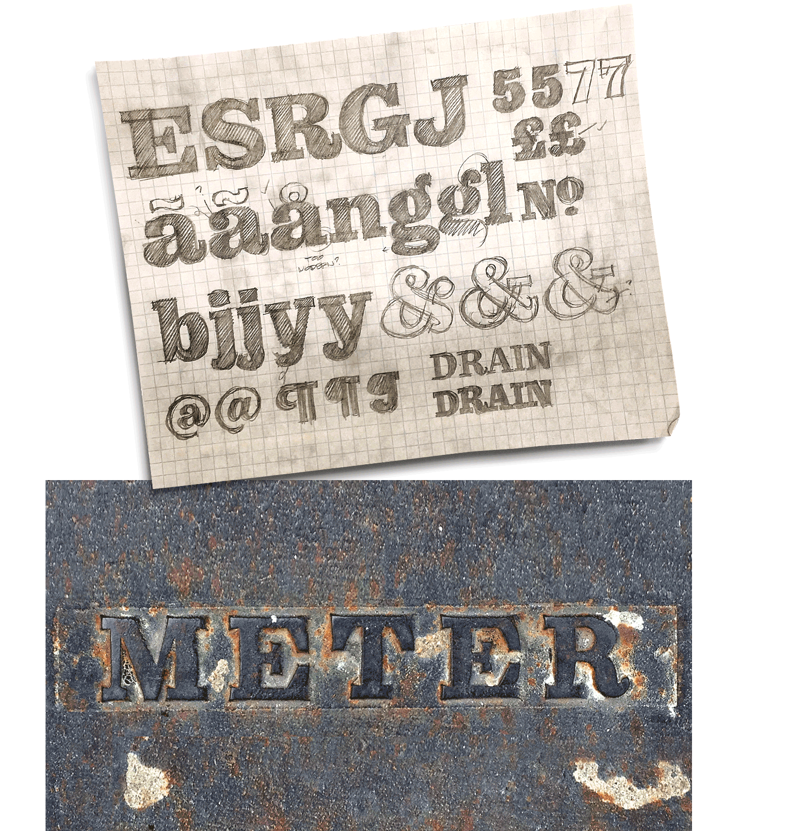
Over the last decade, Ken has documented hundreds of examples of utility covers. He really took advertising icon Mary Wells Lawrence’s quote about “gathering information from all available sources” to a junky degree. What made the New Bedford Gas & Electric ampersand unusual was its unconventional look. It was definitely drawn by someone outside the type aficionado milieu, and that pedestrian approach appealed to Ken’s unorthodox methodology. That departure from early typographic models and thinking led Ken to revisit a favorite slab serif: Stevens, Shanks Antique No. 6. This reminded him of the aesthetic and practical concerns that a typeface needs to balance, something Ken appreciated in the simplicity and beauty of the covers’ ornamental details (which also happened to keep people from falling on their ass when they tread on them). It was also encouraging and reassuring that those same principals were followed by the 19th century iron foundries that produced the covers dotting the streets across America.

At House, the fastest way to get a font from idea to execution—and “fast” in the world of type production is definitely a relative term—is to pick up a pencil and start sketching. Ken’s initial drawings riff on the offbeat gestures and moments that attracted him to the vernacular letterforms in the first place. Expanding these notions throughout a complete character set, and gradually over a comprehensive family of multiple weights and styles—including a series of graphic ornaments inspired by the covers—is an exercise in art, discipline of craft and sheer mind-numbing grunt work.
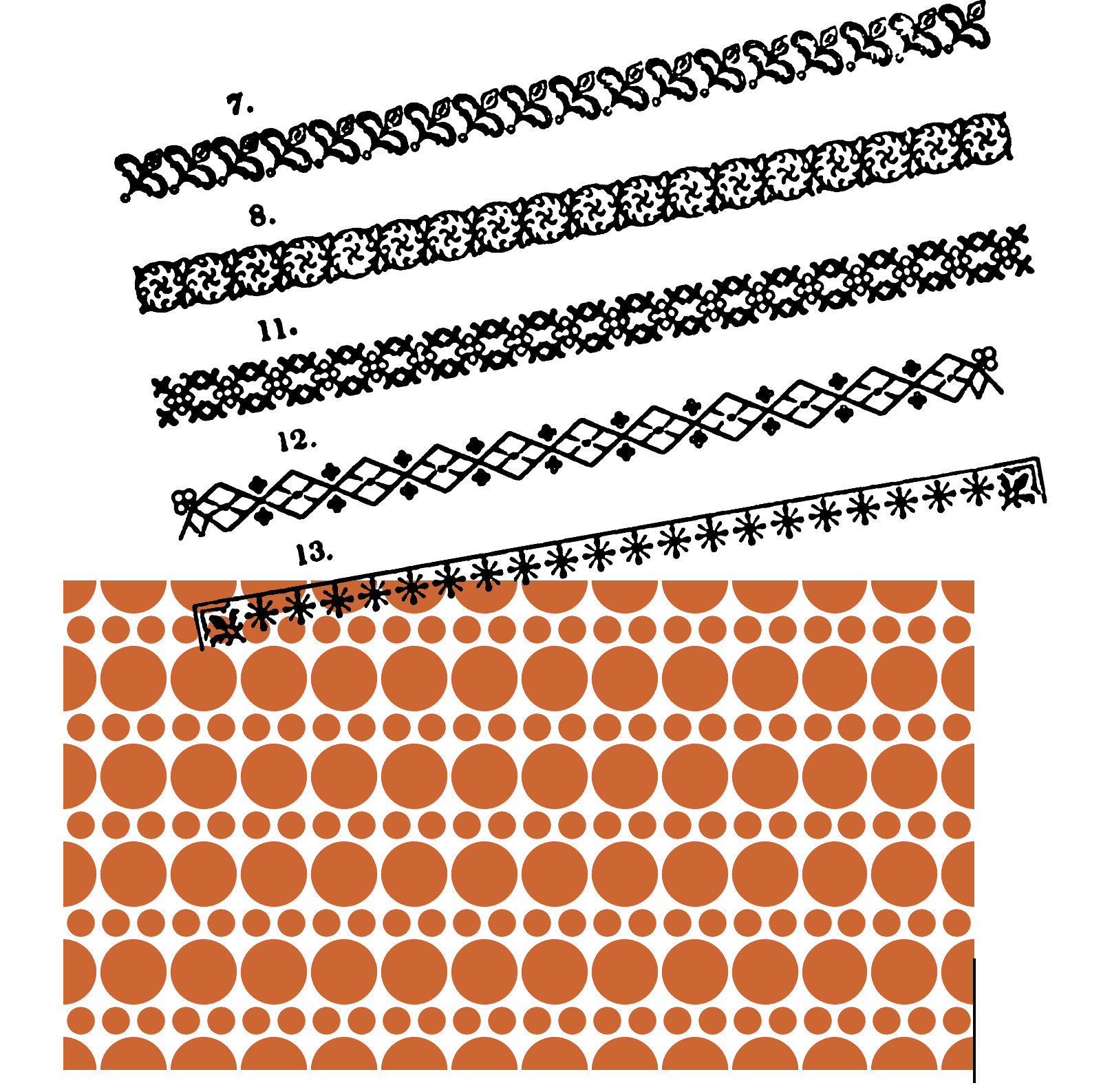

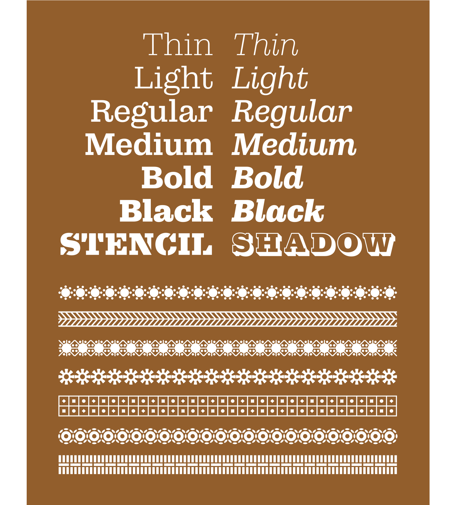
What started as a single workhorse—Municipal Cast—the typeface has grown into a broad-ranging collection of 15 fonts optimized for text and display in print and screen environments, including stenciled and shaded styles for large out-of-home applications. The twenty-six pattern motifs re-imagine the ornamentation on iron manhole covers as useful design elements. Together, Municipal’s easy-on-the-eyes silhouette is perfect for books, magazines and print material. Its clarity and solidity also make it ideal for web applications, wayfinding signage systems, and of course, brands, products and personal identities looking to steal attention. At its core, Municipal is built for the local town hall feel its name implies, while at the same time it embodies a robust and handsome character capable of global ambitions.