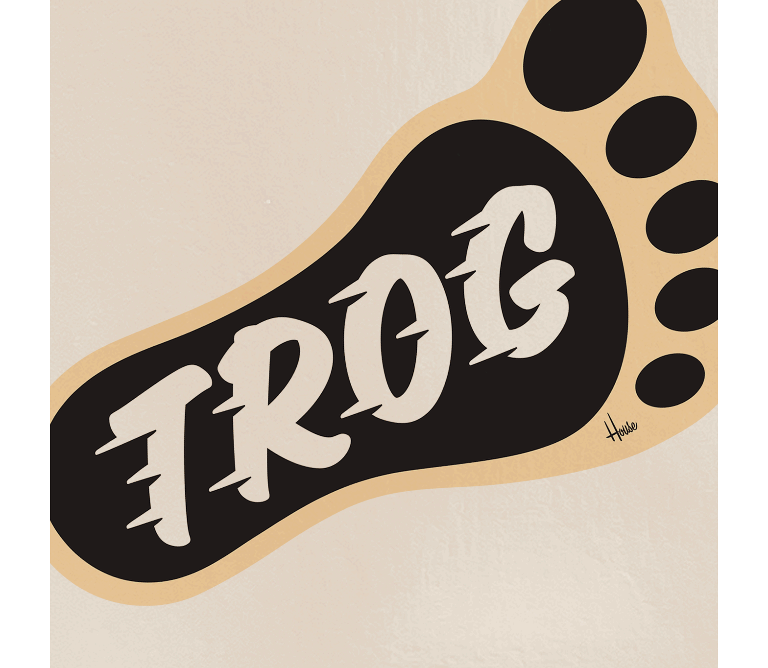
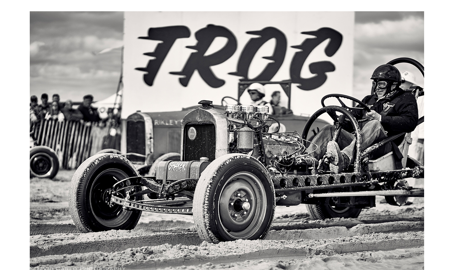
Like most conversations at House, talks with The Race of Gentlemen (T.R.O.G) started with a bullshit session about bad cars and good design. Eventually we got to the idea of creating a logo to visualize the annual beach drag racing spectacle that is T.R.O.G.
As an aficionado of auto culture, and son of a legendary hot rodder & pinstriper, House’s Andy Cruz honed in on capturing the feel of the event, “I saw speedlines and a script as a way to bottle the essence of period-correct motorcycles and cars with the brine fuel vapor smell we love about T.R.O.G.”
Founder Mel Stultz describes T.R.O.G. as a “mechanical reprieve from an excessively mundane world anesthetized by a backlit, binary grip on humanity.”
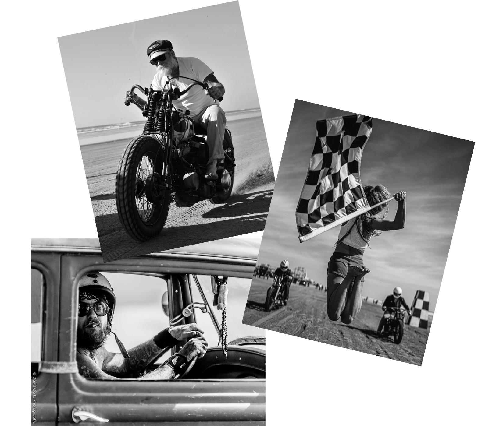
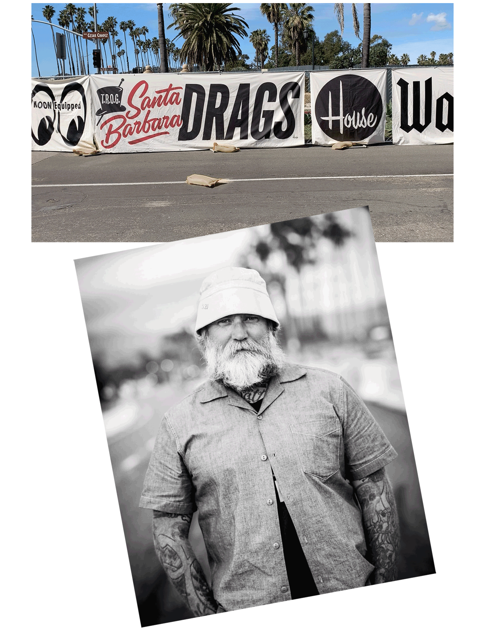
Inspired by a 1905 drag race held on the beaches of Cape May, NJ that included racers Henry Ford, Louis Chevrolet, and speed record holder Walter Christy, T.R.O.G. is now an annual event spun on the sand in WildWood, NJ and west coast digs in Pismo Beach and Santa Barbara, CA that draws racers—and purists— from around the globe.
“I believe T.R.O.G. taps into something primal and emotional,” says Mel. “A weekend retreat with late nights and early mornings where you laugh and yell and experience nature in the strangest possible way. It’s a reminder that some of the most admirable aspects of humanity have yet to die off.”
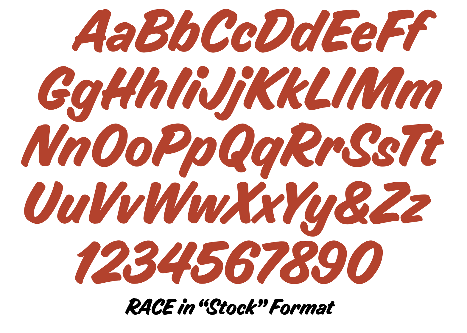
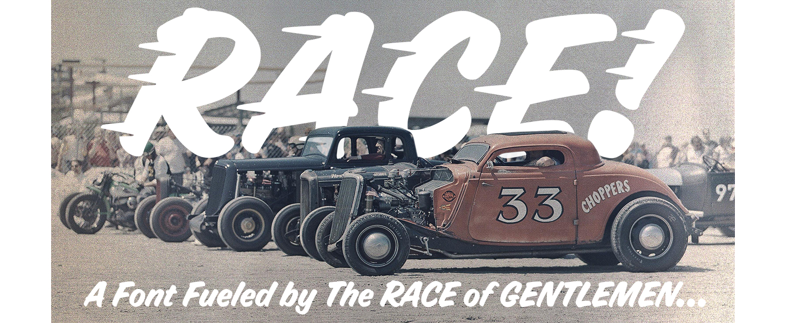
Something about the logo’s speedline trick and jaunty stance inspired Andy and House’s alpha-numeric magician, Ken Barber, to turn the letters into a font and RACE was born. (in both stock and modified formats)
“The process was instinctual and fluid because there is this deep trust with Mel and no corporate layers or uninformed branding opinions,” says Andy. “In my experience, that is something that brands forget about these days when it comes to creating authentic visuals, not death by committee board meetings.”
To capture the aesthetic, Ken employed a single-stroke “knockout” brush style for added typographic torque. “It really follows a stylized approach long-favored by hot rod pinstripers and sign painters,” says Ken. “All at once it looks smart, casual, approachable, not to mention fast.”
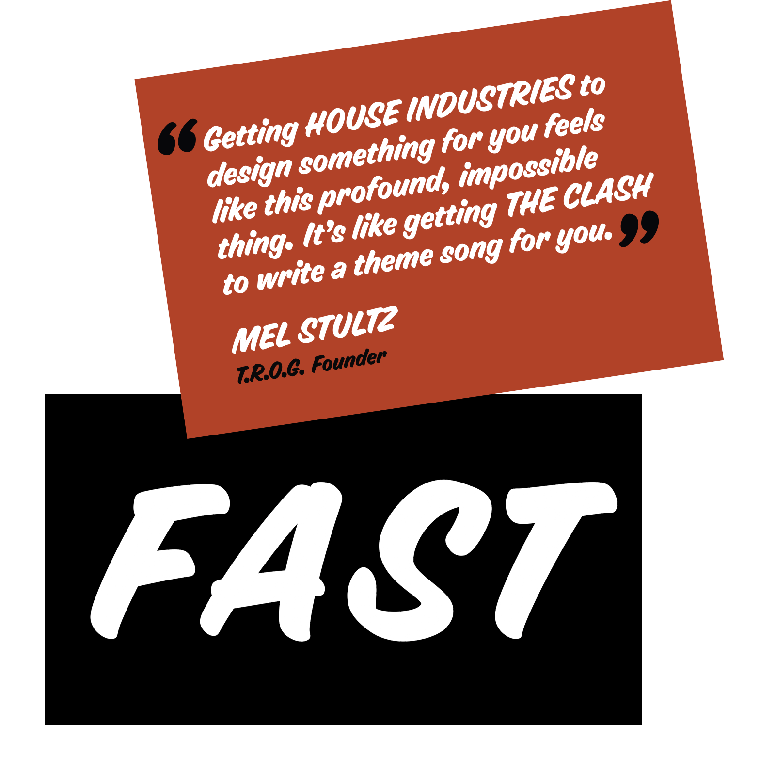
Like the T.R.O.G. event itself, the logo and font are real, jarring and built on a foundation of friendship. According to Mel, “Getting House Industries to design something for you feels like this profound, impossible thing. It’s like getting The Clash to write a theme song for you.”