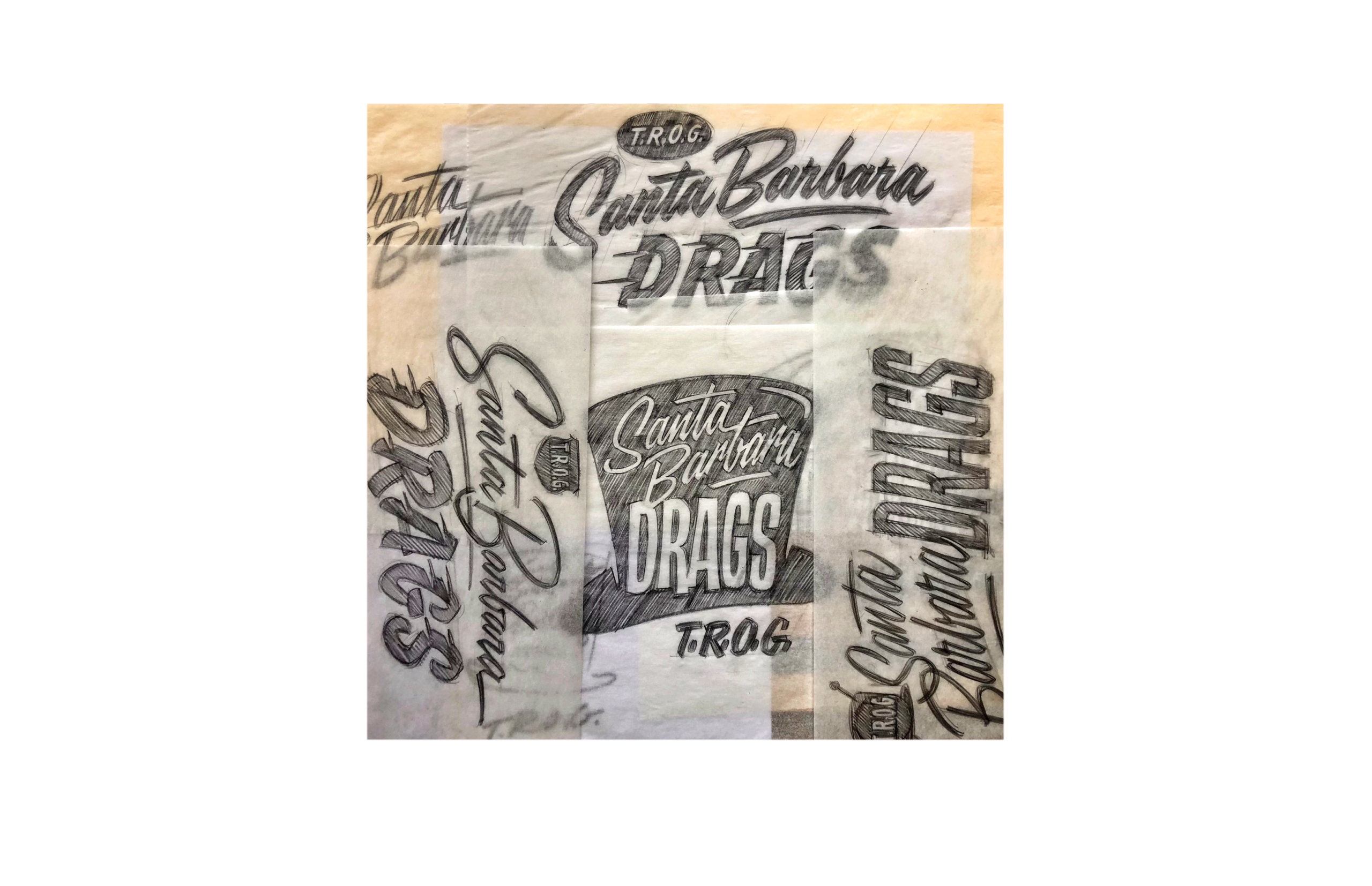
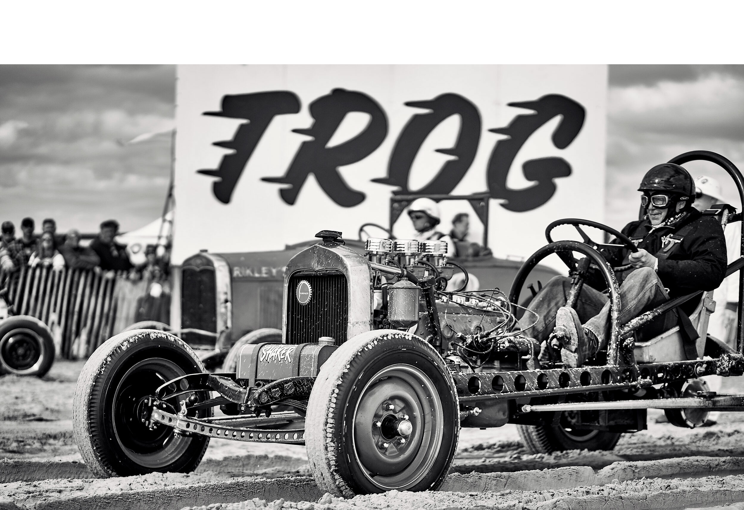
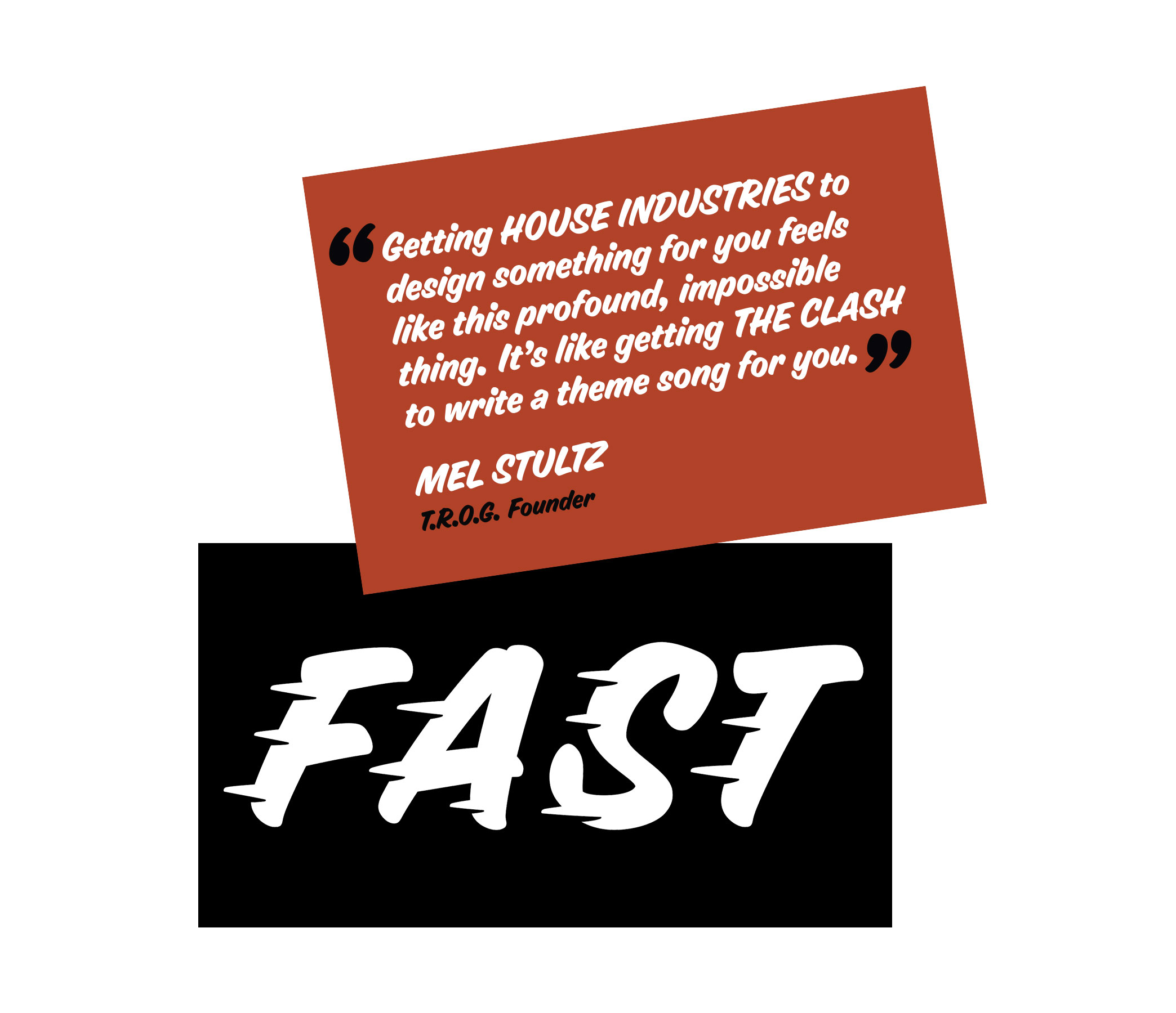
Like most conversations at House, talks with The Race of Gentlemen (T.R.O.G) started with a bullshit session about bad cars and good design. Eventually we got to the idea of creating a logo to visualize the annual beach drag racing spectacle that is T.R.O.G.
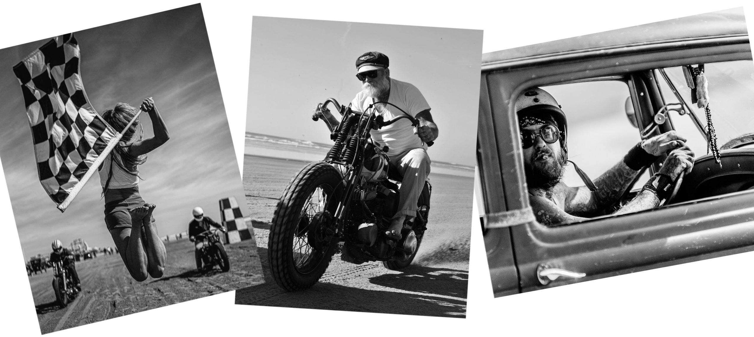
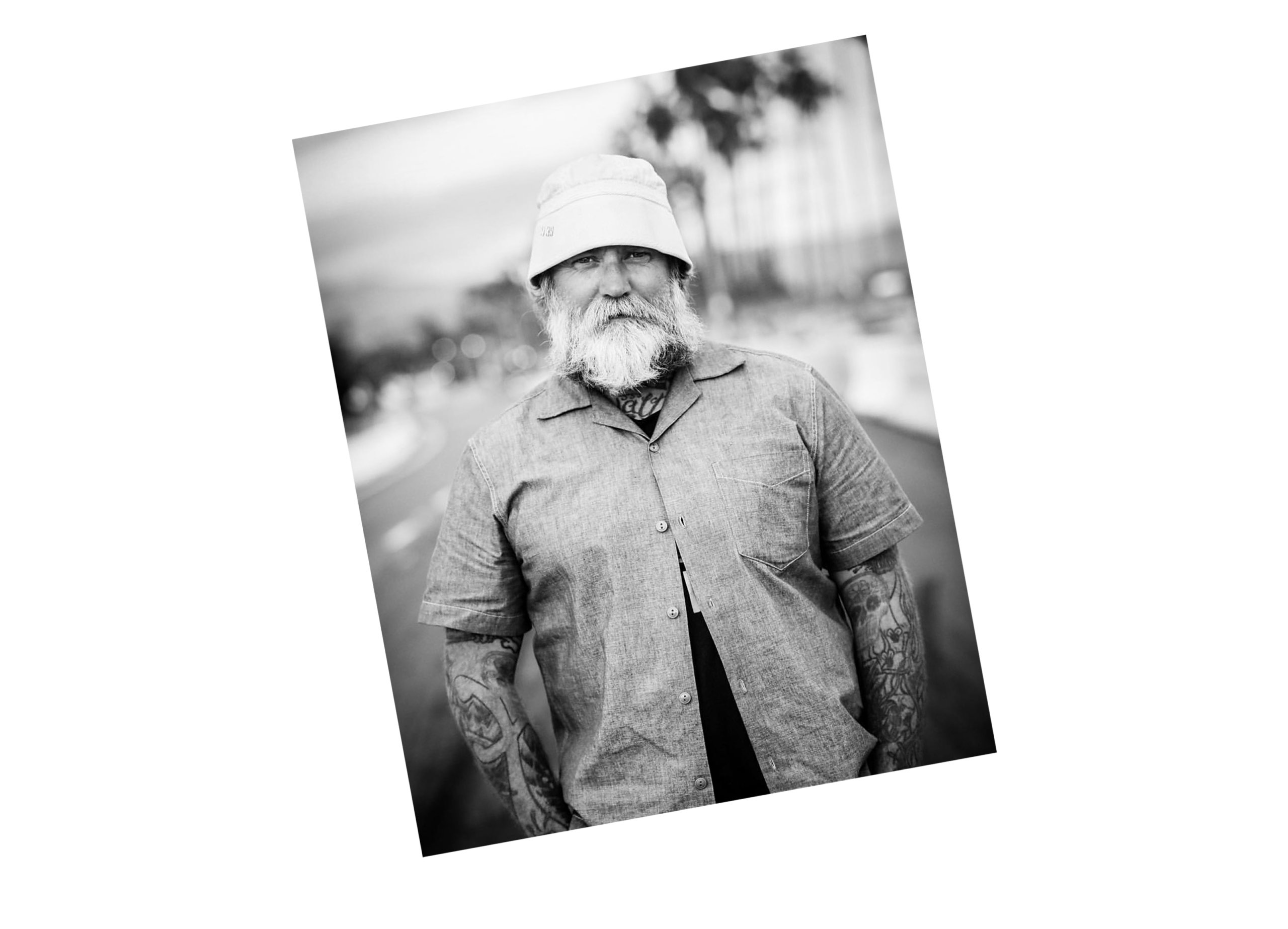
Founder Mel Stultz describes T.R.O.G. as a “mechanical reprieve from an excessively mundane world anesthetized by a backlit, binary grip on humanity.”
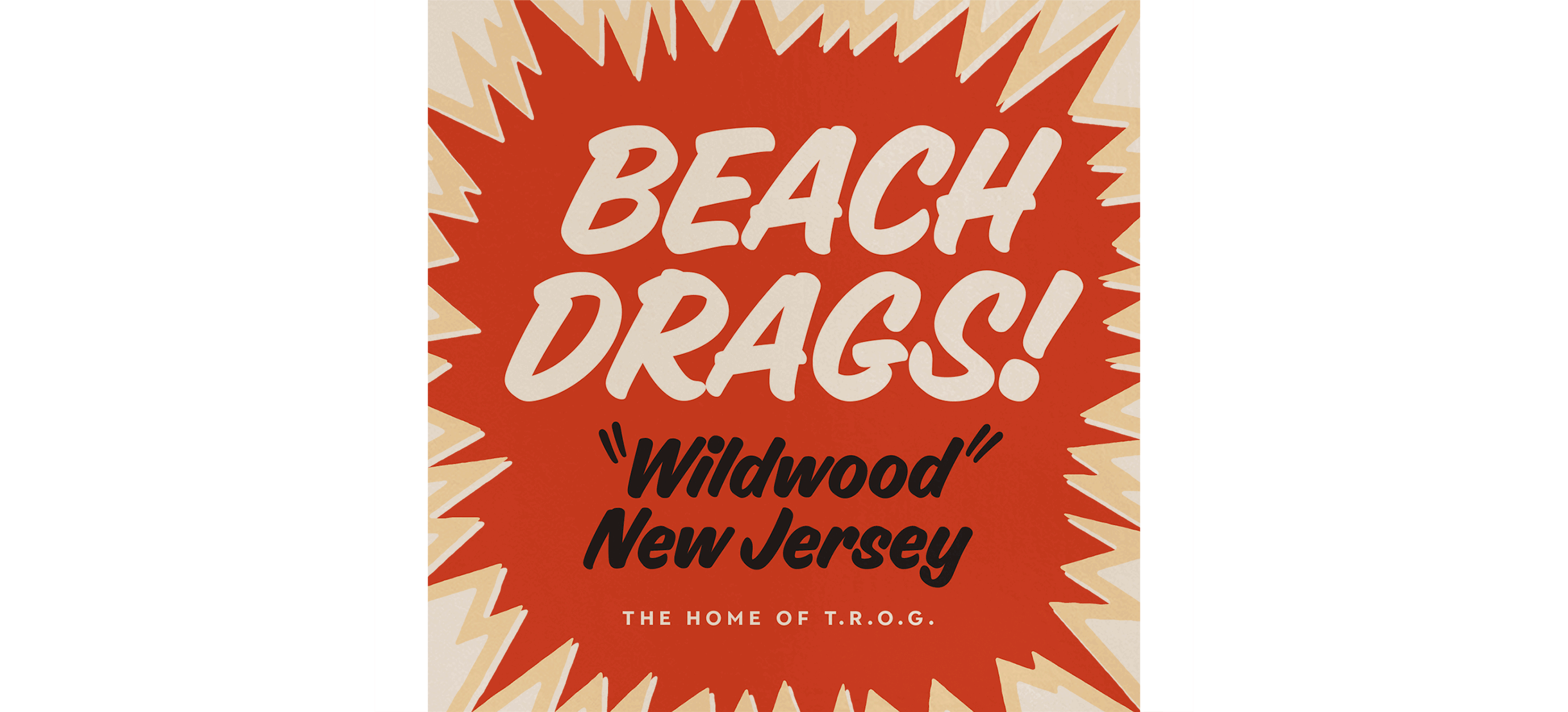
Inspired by a 1905 drag race held on the beaches of Cape May, NJ that included racers Henry Ford, Louis Chevrolet, and speed record holder Walter Christy, T.R.O.G. is now an annual event spun on the sand in WildWood, NJ and west coast digs in Pismo Beach and Santa Barbara, CA that draws racers—and purists—from around the globe.
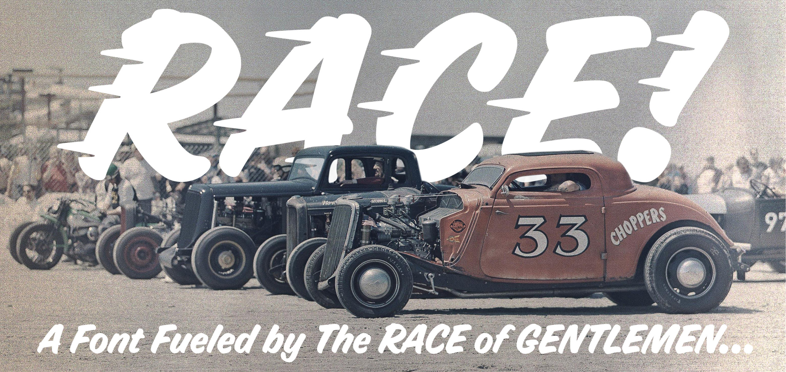
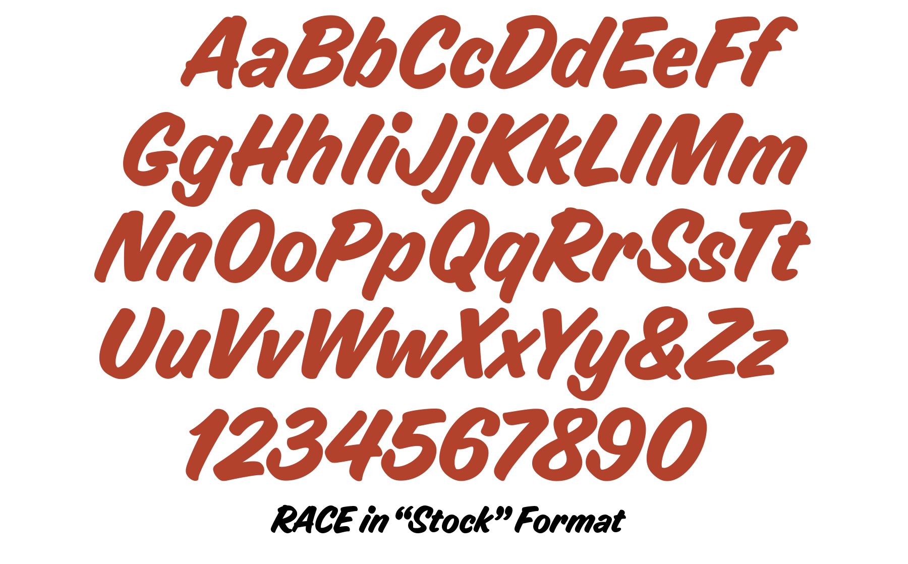
Something about the logo’s speedline trick and jaunty stance inspired Andy Cruz and House’s alpha-numeric magician, Ken Barber, to turn the letters into a font and RACE was born. (in both stock and modified formats)
To capture the aesthetic, Ken employed a single-stroke “knockout” brush style for added typographic torque. “It really follows a stylized approach long-favored by hot rod pinstripers and sign painters,” says Ken. “All at once it looks smart, casual, approachable, not to mention fast.”